Hey, so we’re going to look at something different tonight in Fine Art. We’re not looking at environments, or characters, or weapons, or user interfaces, or animation, or any of the other stuff we normally feature. Instead, we’re looking at typography
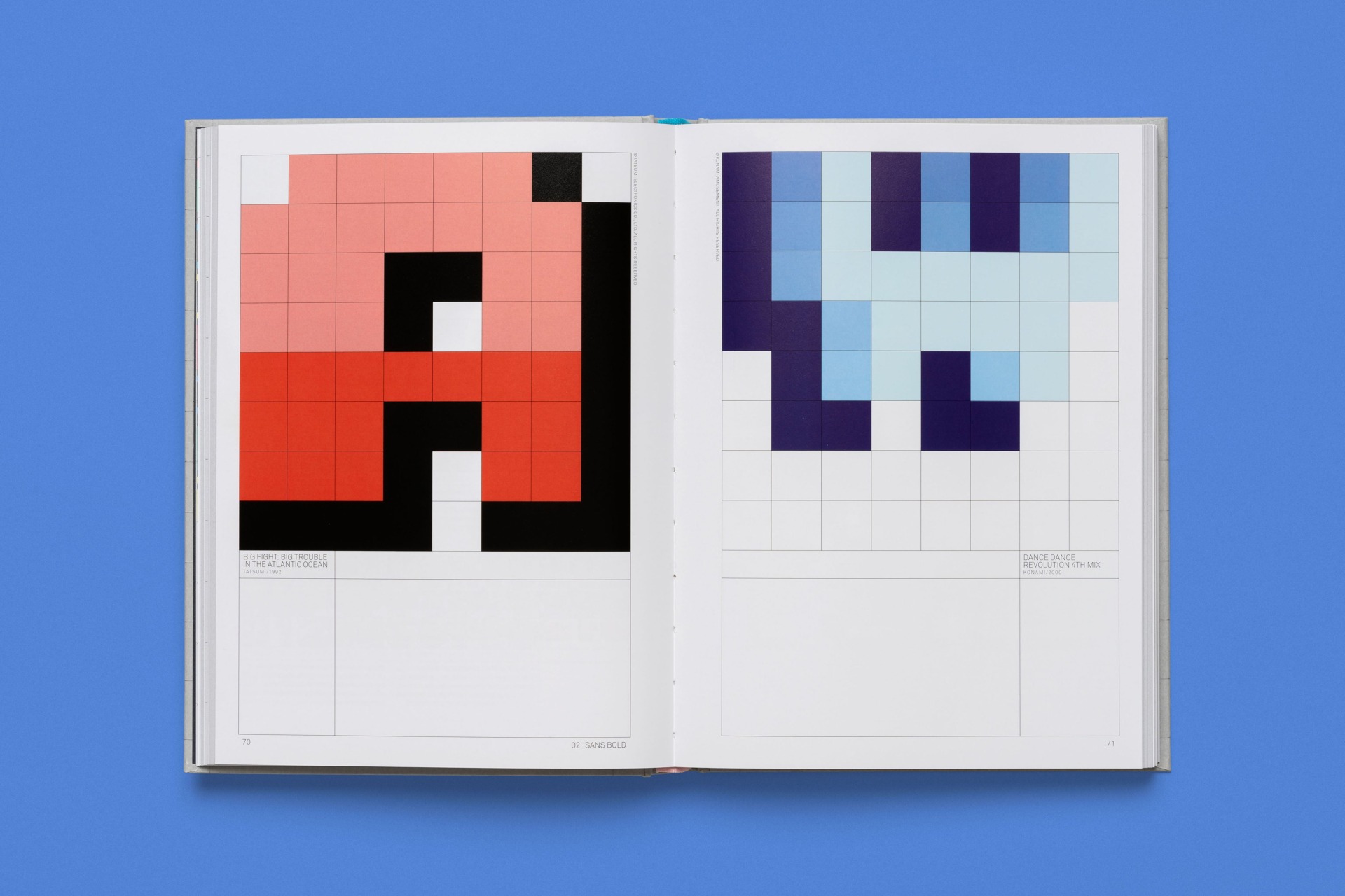
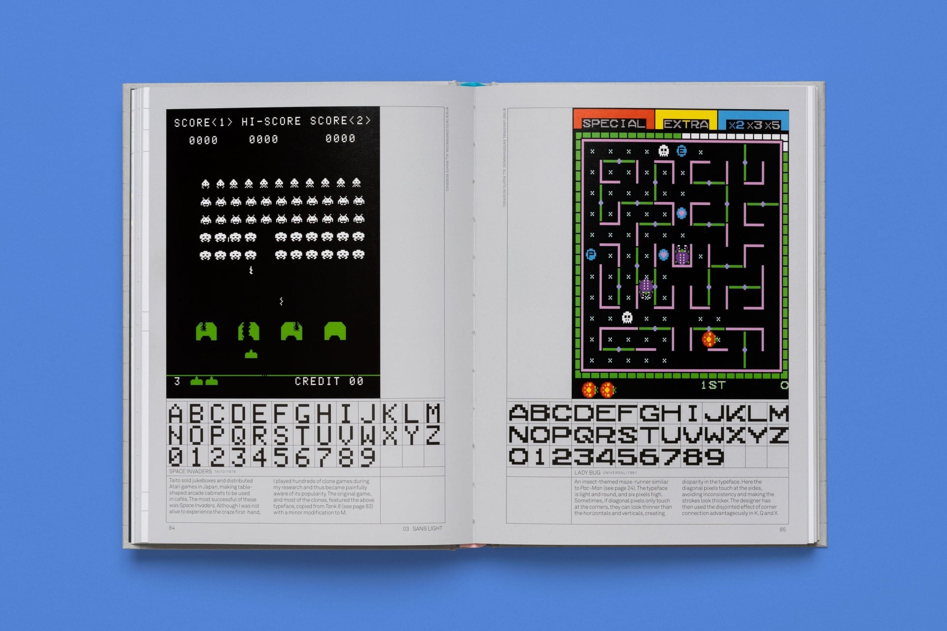
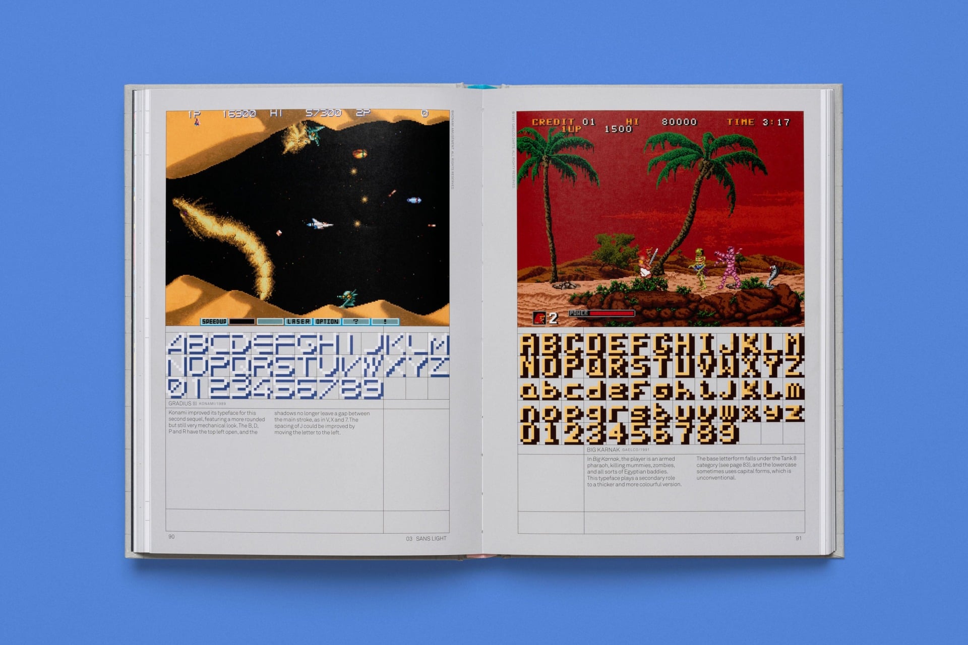
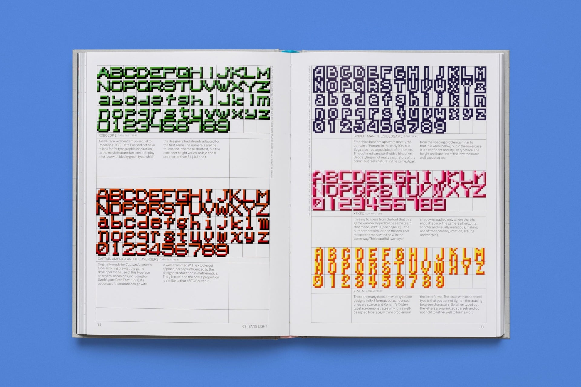
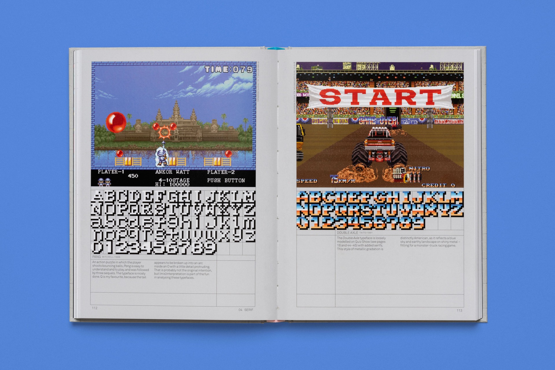
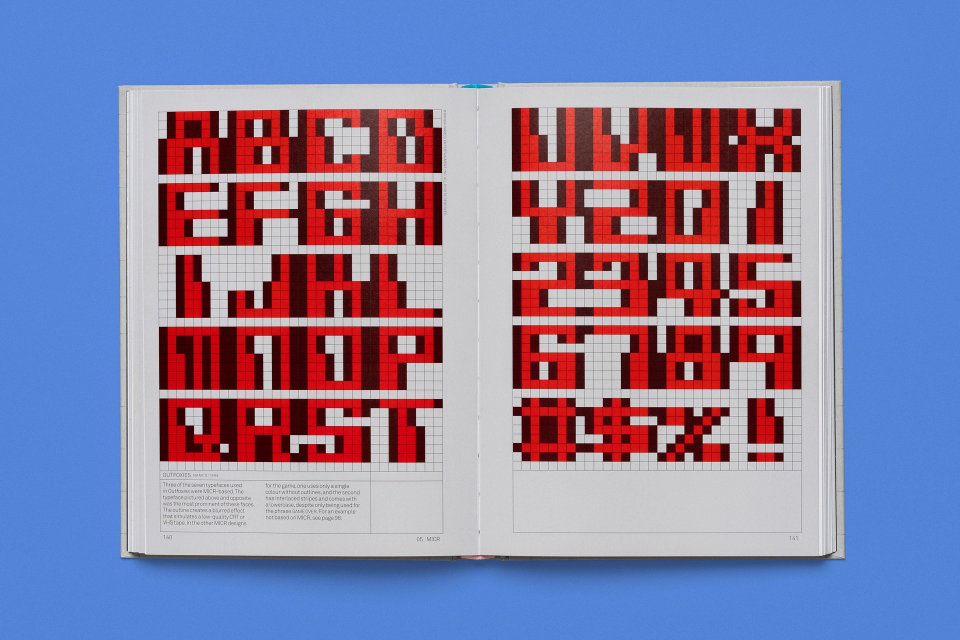
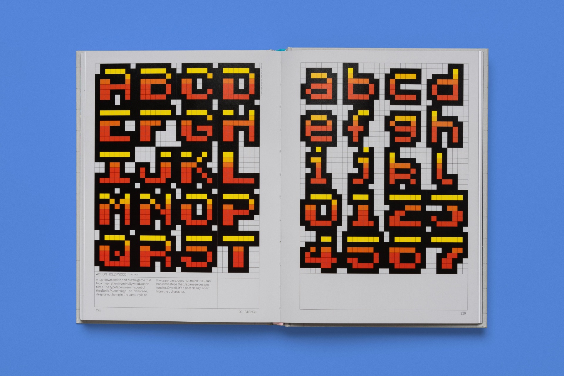
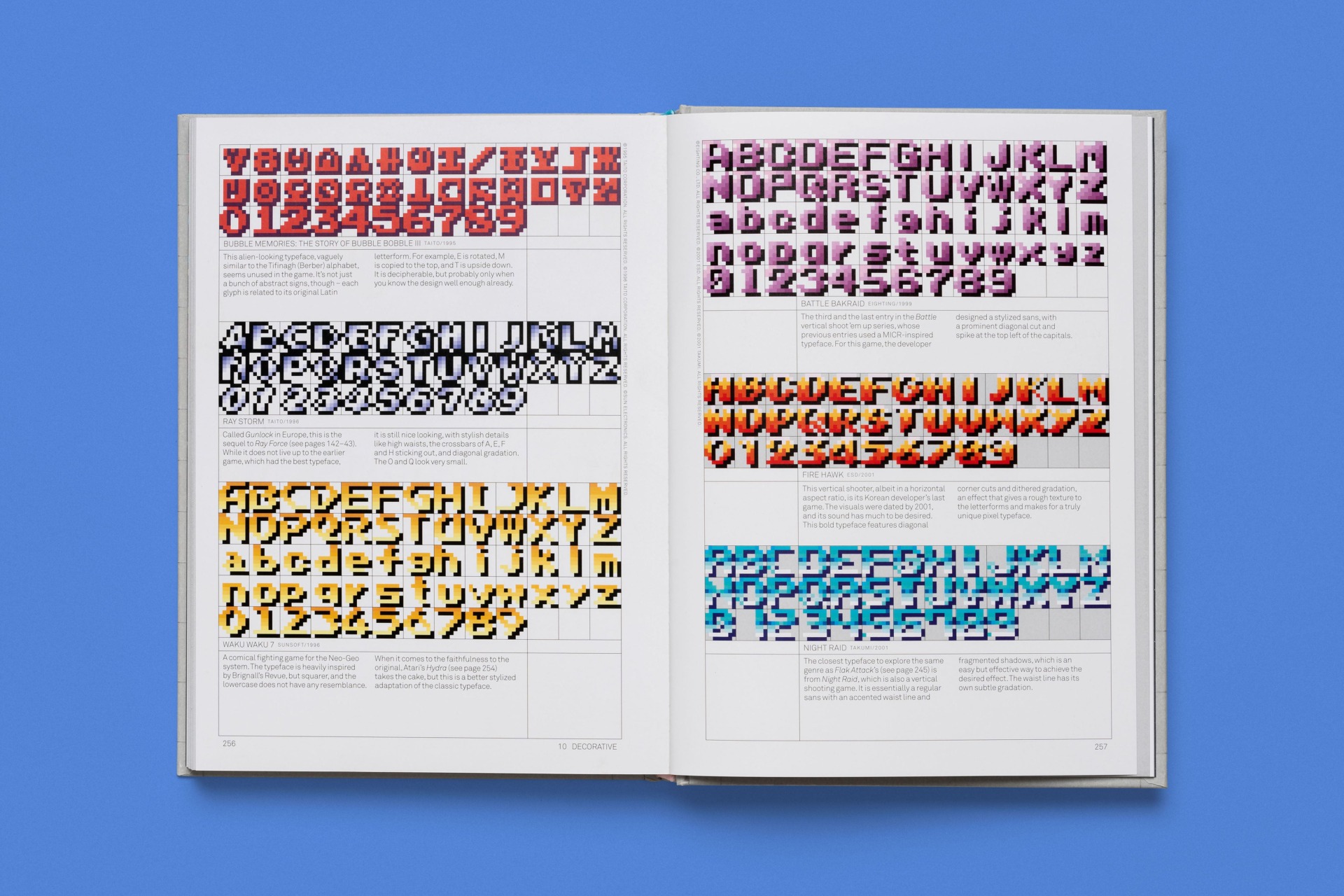
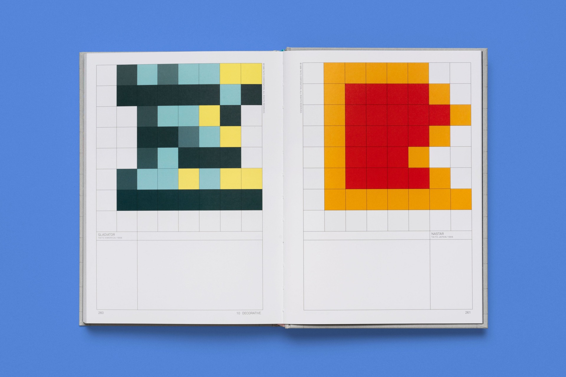
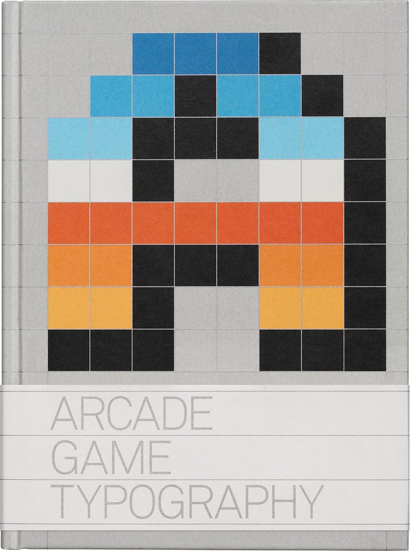
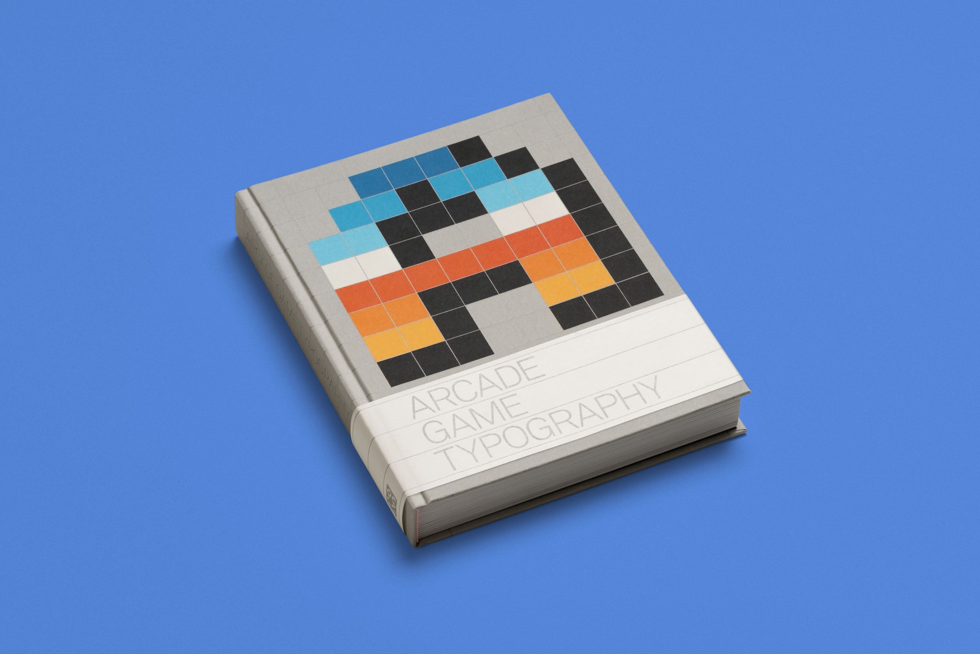
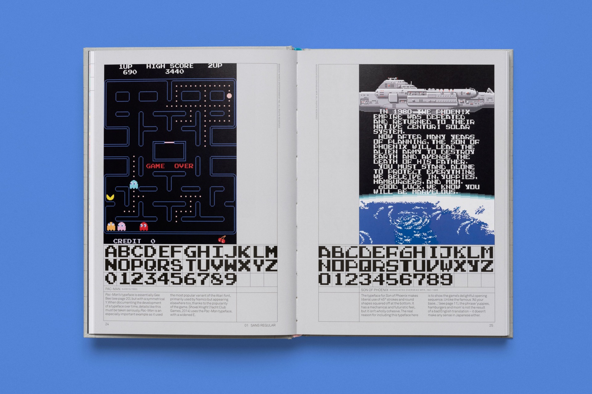
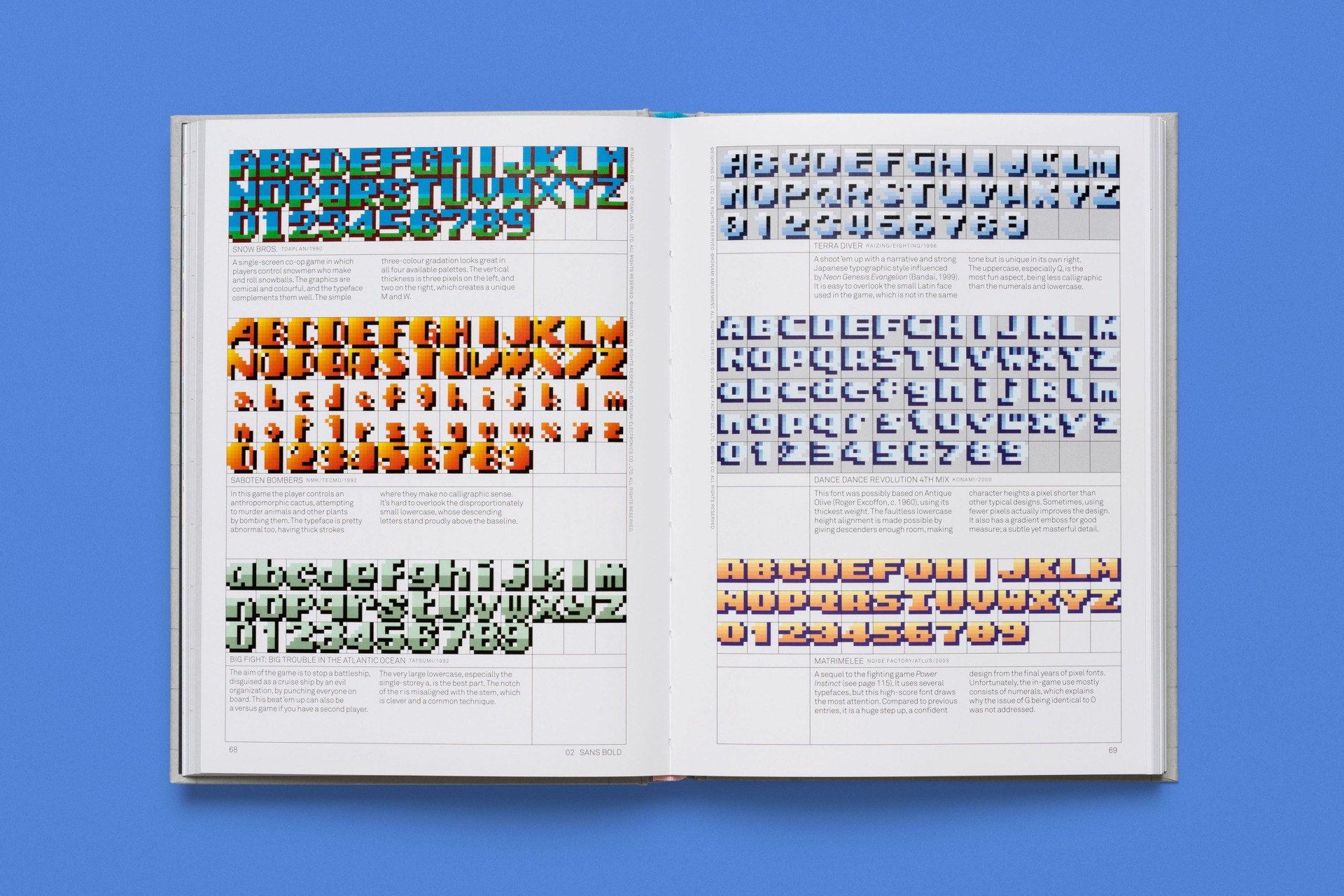
Read-Only Memory have released a book called Arcade Game Typography, which they describe as “a definitive and beautifully designed survey of ’70s, ’80s and early ’90s arcade game pixel typography”.
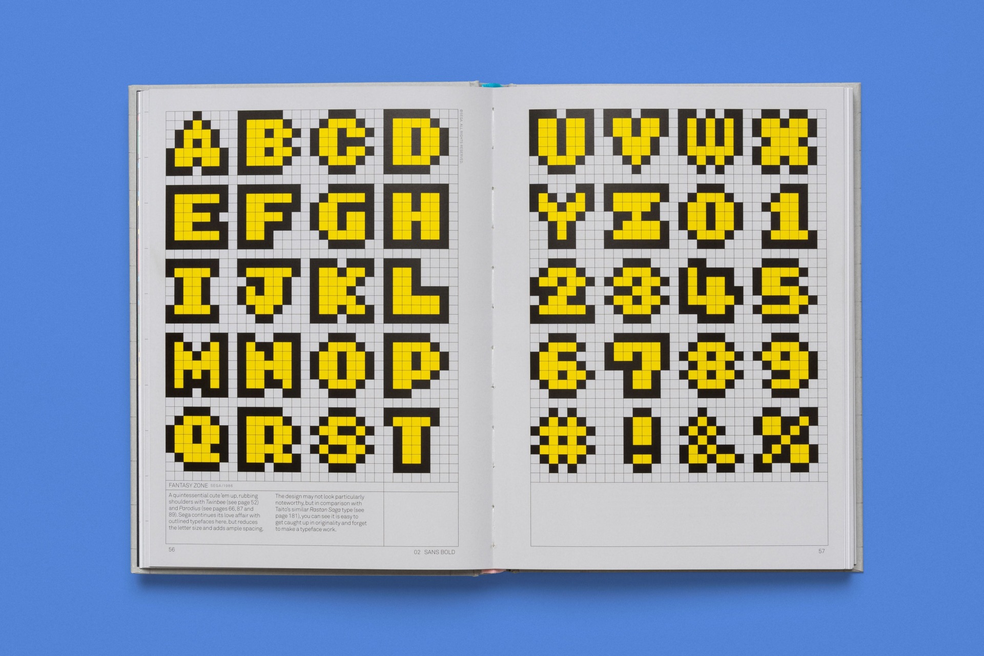
It features 250 typefaces from games like Pac-Man, After Burner, Marble Madness and Shinobi, and Read-Only Memory were kind enough to share some examples of what’s in the book here.
You can check out the samples below, and you can read more about the book (or buy it, even) here