1995’s WipeOut was one of the coolest video games ever made, as we’ve previously established here, and a big part of that was down to the game’s pioneering visual style.
https://lastchance.cc/wipeout-had-some-of-gamings-coolest-branding-1783707474%3C/a%3E%3C/p%3E
That went for the obvious stuff, like the ship design and team logos, but it extended right through to the game’s logo. For a very particular breakdown of why it was all so good, check out this thread by Y2K Aesthetic’s Froyo Tam:
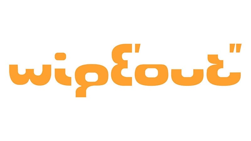
The Wipeout logo was designed by The Designers Republic in 1995, a landmark studio in Y2K graphic design. Upon looking at the design closely, one can notice these letters are actually made from partial 8 glyphs. Below are the overlays of the Wipeout logo with Eurostile’s 8 glyph. pic.twitter.com/KB7bhFKJ9v
— Y2K Aesthetic Institute 💽 (@y2k_aesthetic) December 12, 2018
Why the ‘ and “ marks? They denotate the minutes and seconds used in racing and implies speed. pic.twitter.com/Se7DBE1HAc
— Y2K Aesthetic Institute 💽 (@y2k_aesthetic) December 12, 2018
I contacted Ian Anderson, the head of tDR about this over a year ago, and he was able to confirm it. pic.twitter.com/Tp25OdY6BY
— Y2K Aesthetic Institute 💽 (@y2k_aesthetic) December 12, 2018
Hope you enjoyed learning about the Wipeout logo!
My twitter is @FroyoTam, insta is: https://t.co/TWFETQ82En, and my design portfolio is https://t.co/jf0Z07RzU9.
— Y2K Aesthetic Institute 💽 (@y2k_aesthetic) December 12, 2018