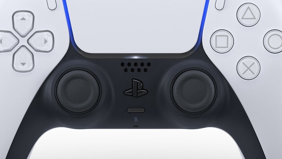
Since the PS3, DualShock controllers have had a nice, round home button nestled between the analog sticks that you can easily press to quickly return to the console’s main menu. The PS5’s DualSense changes that. I hate it.
Instead of a small acrylic lump with a PlayStation logo on it, the DualSense’s home button is an entire miniature PlayStation logo. It’s barely raised above the surface of the plastic; you don’t immediately feel the button as your thumb grazes the lower part of the controller searching for it, and the edges poke you once you finally do. It’s camouflaged in all black, almost as if the controller’s most important button—the one that powers on the console and lets you back out of games—doesn’t want to be found, or used, or least of all enjoyed.
Look, redesigns are always a tough pill to swallow, especially when they follow on the back of fairly decent ones you’ve grown extremely accustomed to. I spent seven years with the DualShock 4 and the PS4’s menu system, neither of which I loved, but both of which have taken on a familiar warmth after thousands of hours of treating them like extensions of my own mind and body. A couple months into the PS5’s life, its weird design choices are still annoying me. I don’t see getting over things like the DualSense home button not immediately taking me to the homescreen, and the button itself posing more as a piece of iconographic flair than practical interface, anytime soon.
I’m not alone, either. Here’s how Kotaku freelance editor and Rock, Paper, Shotgun co-founder John Walker put it to me over Slack DMs:
What throws me is it looks like branding, not a means of interaction. Multiple times I’ve completely forgotten it’s a button, then assumed the reason I cannot find the menus I’m looking for is because of the complete mess of its new dashboard, rather than that I’ve forgotten a whole other subsection of its overlapping Möbius interface.
I agree this makes little sense on my part—it’s in exactly the same place as the “PS” marked round button on the previous controller, so I don’t really have a good excuse. But gosh, there’s something just so powerfully odd about its now being this peculiar relief glyph. Its semiotics scream “DON’T PRESS ME!”, before you even get to how unpleasant it is as a tactile interaction.
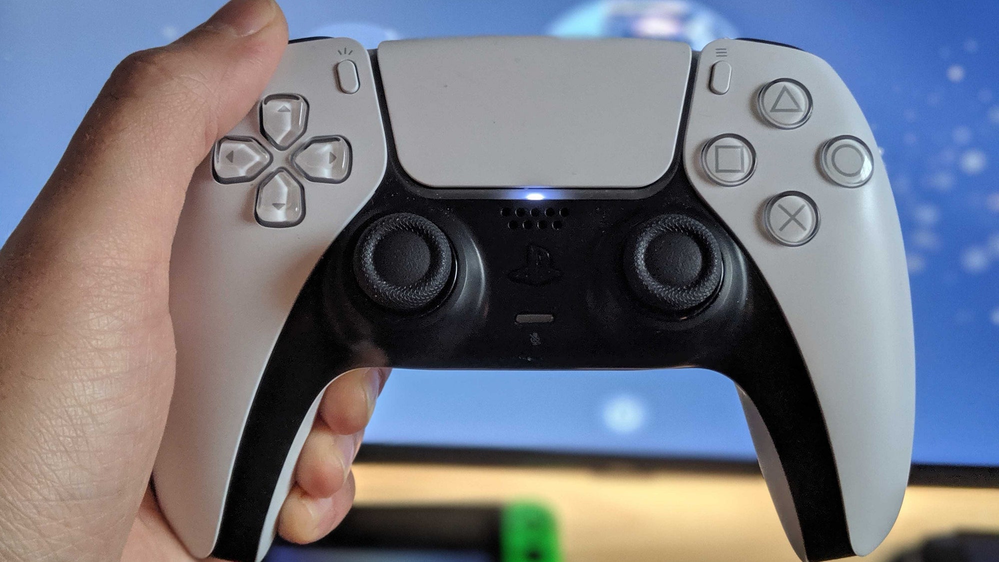
The button’s also a major buzzkill when it comes to DualSense customization. Kotaku senior reporter Mike Fahey recently had controller modder Colerware send him a DualSense decked out in pink and black. The thing looks sharp as hell, and speaks to the flexibility when it comes to personalizing your PS5 controller—except for the home button. “The only downside of customizing the DualSense controller is you can’t really do much with that damn PlayStation logo button,” he wrote. “No matter what color you paint it, it’s still what it is.”
https://lastchance.cc/the-ps5s-dualsense-is-the-perfect-canvas-1846010994%3C/a%3E%3C/p%3E
In so many ways the DualSense is a monumental step up from last generation. Too bad the button I touch first every time I turn on my machine isn’t one of them. Maybe Sony will fix it with a DualSense Pro.